


Operational Innovation - Clock-in
Overview
Operational Innovation was a permanent team that explore how design can help in store processes. The product in question aims to reduce a significant amount of tasks that managers do each day - these tasks are called exceptions.
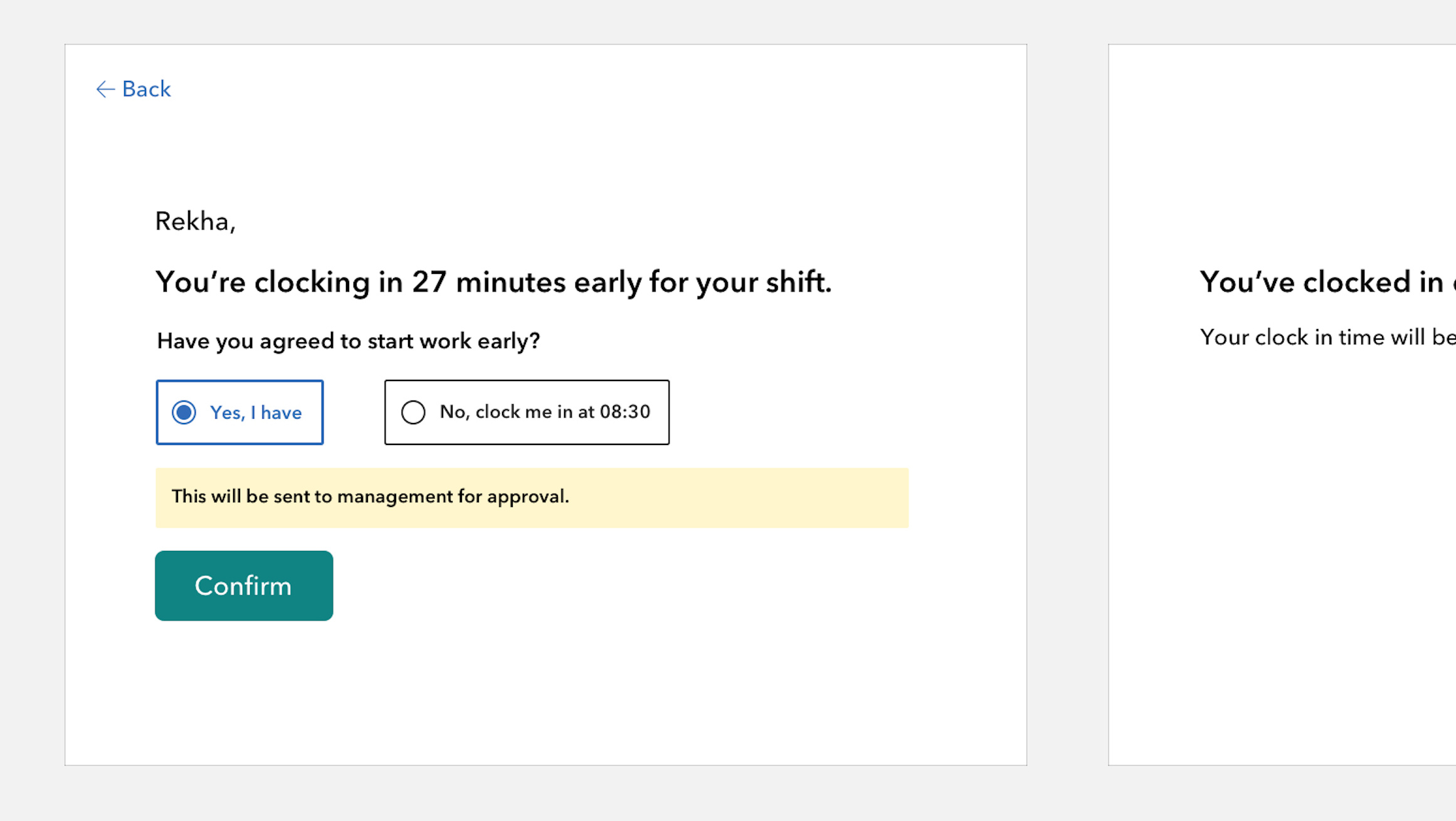
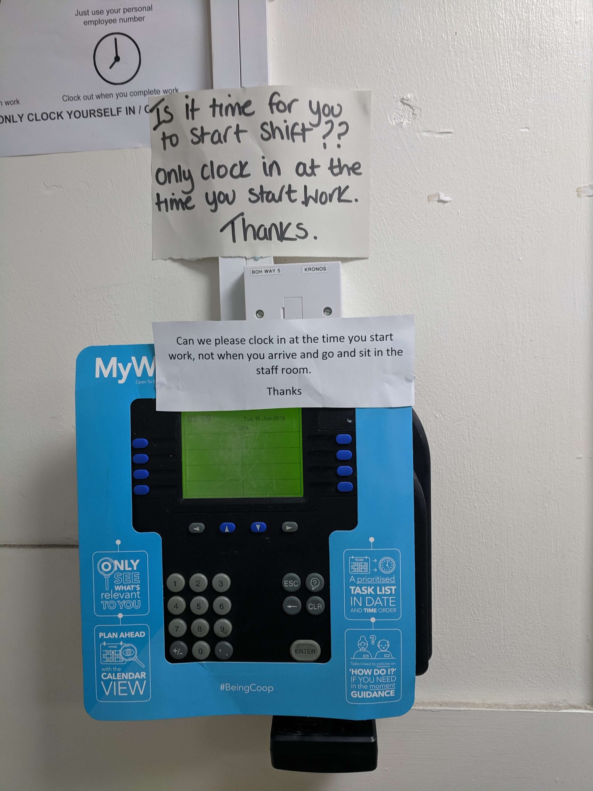
Exceptions are created when colleagues work outside of their scheduled time. For example, clocking in early, clocking out late, clocking in when not scheduled or forgetting to clock in or out.
Awareness of exceptions and how time is approved in stores in low - this creates 1000's of exceptions across Co-op Food stores each week that all needed to be corrected to ensure colleagues are paid correctly.
My role in the team
I was asked to lead the design of a single product in the Operational Innovation (OI) team while still working on a different product (Shifts) in a different team. I had good awareness of food stores, processes and our users so it made sense.
This was a perfect example of 0-1 design. Stores already have digital displays at check-outs, the displays are used to show customers adverts so they also had the ability to 'speak' to store infrastrucutre So, how might we improve processes for clocking in and clocking out using these physical displays?
I started visiting stores and working with colleagues...
In this team, my responsibilities included:
- Leading the interaction design
- Interviewing colleagues on the current understanding of their timecards and exceptions
- Creating and iterating many 'clickable' prototypes to test with colleagues
- Playing back the findings to the members of the OI team and iterating the design
- Pairing with the Content designer to work through multiple iterations of the text content
- Pairing with off-shore engineers to ensure visual design and semantic HTML met expectations
User research
We needed to test if we could increase understanding of exceptions and timecards, language, interactions and multiple scenarios.
Using our design sytem, I went through many, many iterations of this product through the prototype and testing stages but it brought the simplicity required to be successful. I was working on it in 2020 and it's still used in stores now - 2026.
Interaction design
Simplicity was absolutely vital for this product to be successful - people need to understand information immediately while being asked as little as possible of them.
I would strip the interface back multiple times during prototyping resulting in the 'function over form' aesthestic.
While it doesn't quite delight, I do believe the simplicity resulted in the highly successful uptake across trial stores and then all stores.
Service design
Being able to visit stores and work directly with users to understand the reality of the day-to-day is priceless when re-designing a service and attempting serious simplicity.
I was fortunate to be able to witness the physical environments of the users and why problems occur.
This led to numerous interviews, co-designing and testing the product with them to truly meet their needs and on this occasion, increase their own understating of what was happening behind the scenes to make sure their timecards are correct.
Front-end - Pairing
I wasn't writing any code for this product, even at prototype stage but I was pairing with an off-shore team which prior to remote working was new for me.
I was doing a lot of testing and finding bugs as well as issues with the HTML, for example, every text element was a
at one stage - no headings. I believe quality can drop when working at serious pace and perhaps when third party contractors are working in a totally different country and time zone.
It was a good learning experience.